Hello fellow human.
If you’re reading this, you may have been a Webflail Roundup subscriber.
Or maybe you found your way to my spaghetti heap of a mind distilled in to words from my YouTube channel.
Either way, I’m glad you’re here.
As always, if you’re not glad you’re here, unsubscribe at the bottom of this email.
Should we use 3D in websites?
I’ve got a lot of questions recently along these lines:
“Should we use 3D in websites?”
My take on this is the old classic - it depends.
Let’s be clear - 3D assets can be exported as images, gifs or embedded on a site so these websites I want to show are a mixture of all 3 use cases with some examples in this newsletter.
In some circumstances, I think it can greatly enhance a website’s look and feel and can massively level up a website.
However, when embedding 3D assets, it can be overkill and cause the website slow loading times unnecessarily (as I am sometimes guilty of).
I think it basically comes down to the story you want to tell on your website.
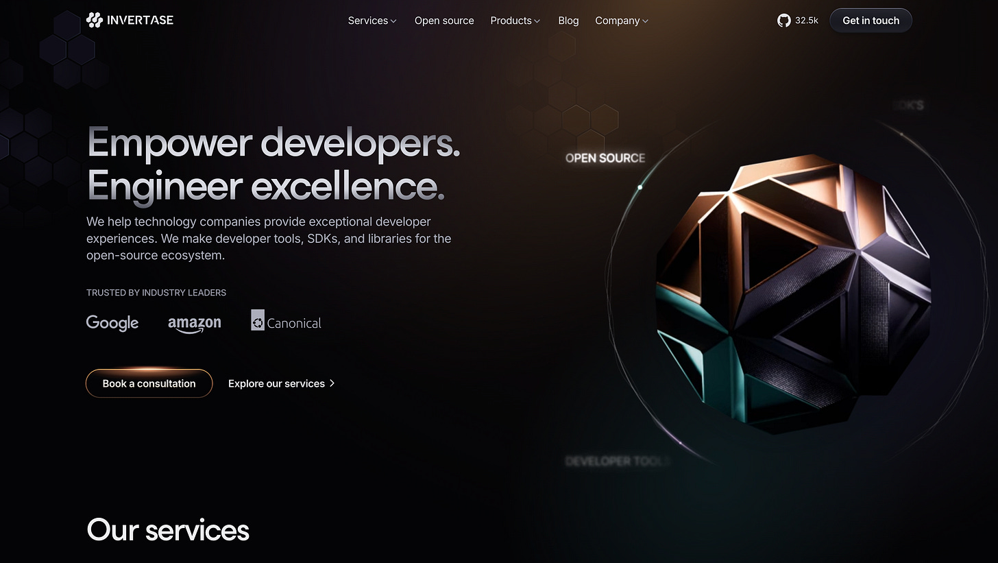
Take this website by Pixel Point for Invertase:
This 3D object adds so much life and dynamism to the website hero header.
It is a brand asset that gives the website a really modern look and feel.
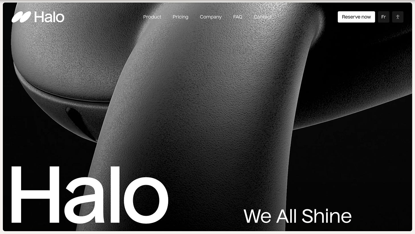
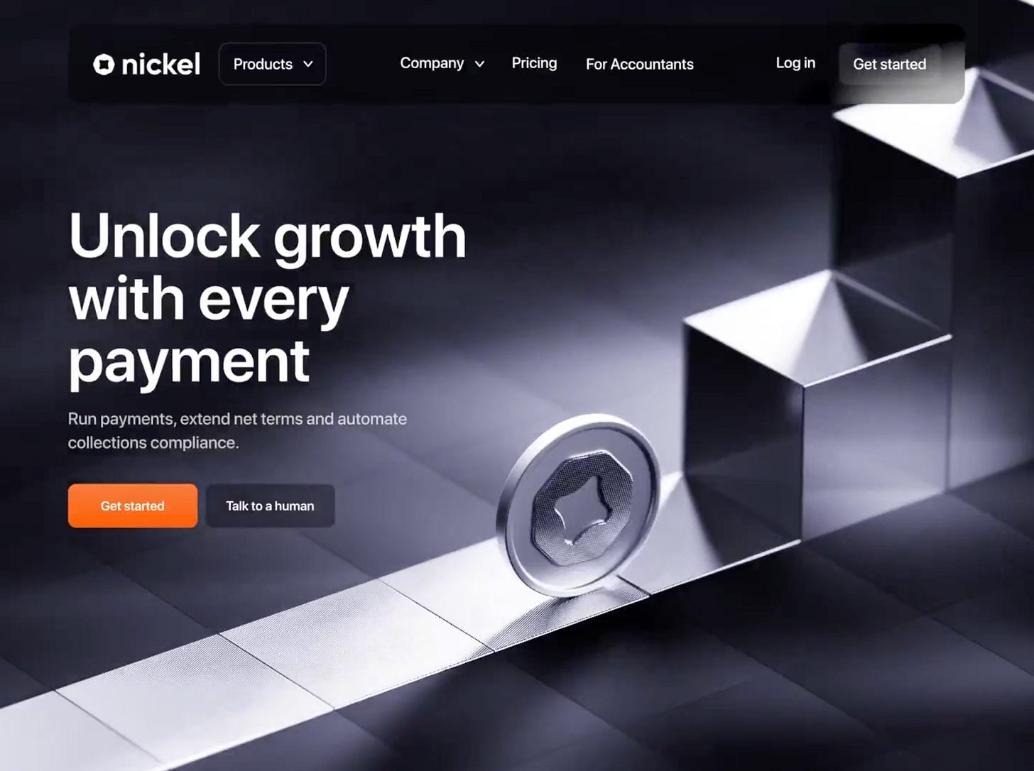
Similarly, take Halo for example.
This 3D rendering adds so much to the homepage and makes you get a really good sense of the materials and premium feel of the product.
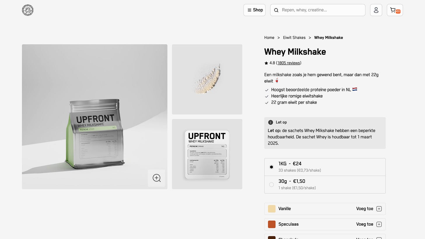
In fact, in e-commerce, I can’t help but think this will soon be common practice. Upfront heavily lean in to 3D for their e-commerce pages to give you a sense of the size and feel of the product but also give it a premium aesthetic.
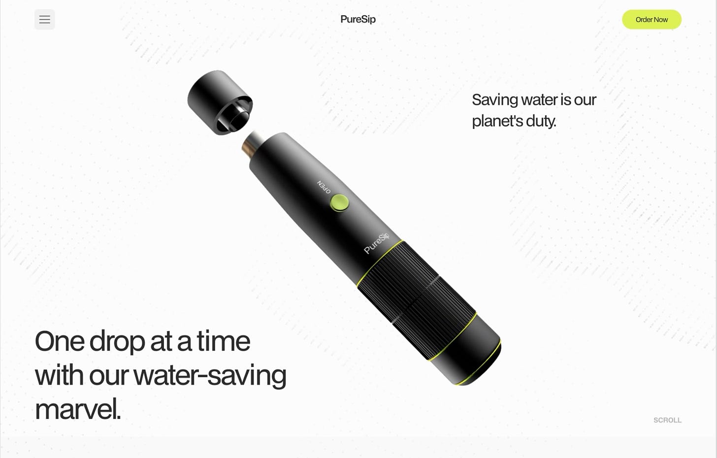
Puresip by Riotters designer, Adam Gotfryd exemplifies this with impactful hero headers that feel classy.
Note how in these examples, the 3D asset is being used in video or gif format.
It doesn’t always have to be an embed.
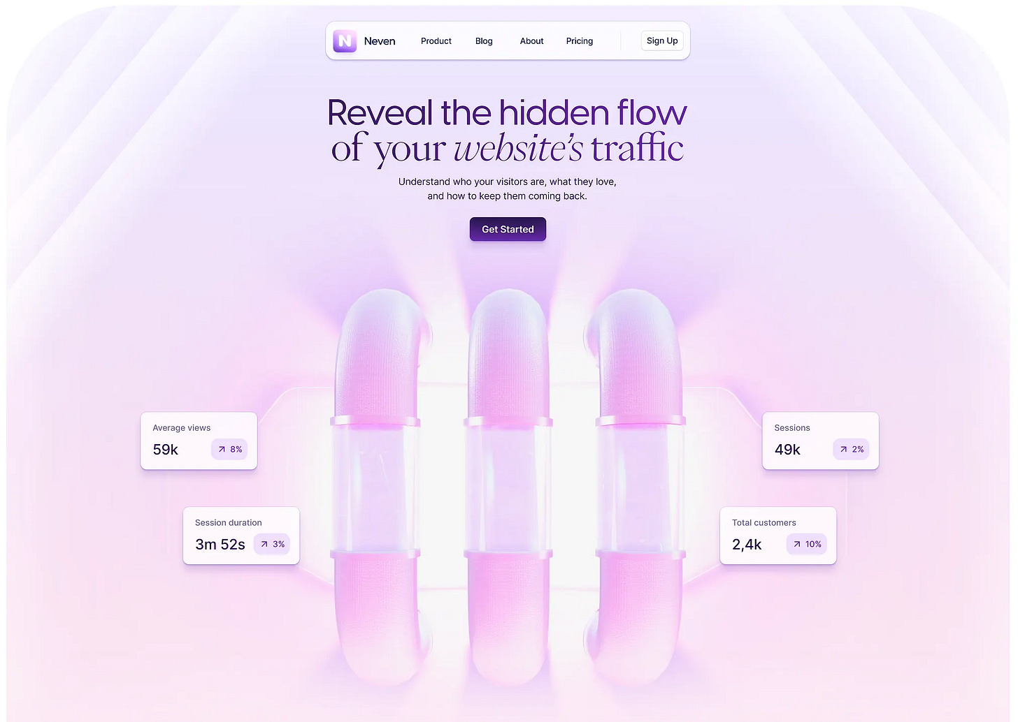
Another Riotters assassin, Paweł Drzewiecki, has also got some really incredible 3D portfolio examples.
This one for Neven shows off how a central asset can be the central theme of a brand identity and website flow.
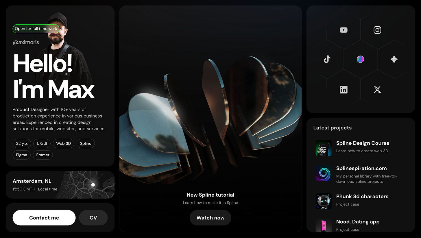
On the other hand, embeds give the user a playful experience.
Dragging this central element in Axi Morris’ portfolio is so intriguing.
Not only does it make this portfolio stand out above other portfolios for me because of it’s brand identity but also it’s killer reflective cylinder which is just so fun.
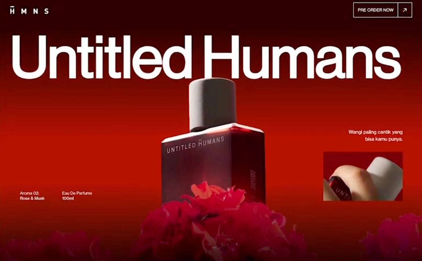
Someone that’s killing it in the design space currently is Azhar Bhagas - this website he released almost broke design Twitter:
He’s really leaning in to Spline, Webflow and Figma. Makes for an incredible story of the product being told though.
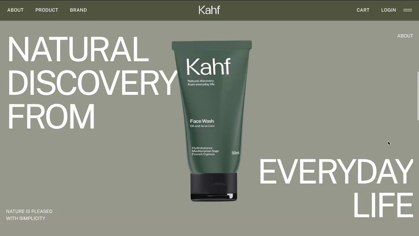
Similarly, his project Kahf also has an incredible scroll effect. Makes you want to understand the journey of this premium product.
Alex Bender can’t stop making work that makes you want to know more.
Fancy.Design is no joke.
But you may be getting the point - 3D give you a storytelling edge that I believe 2D can’t in the same way.
Conclusion
So, in summary, should you use 3D in websites?
Completely up to you but being intentional with the use is the key:
Even if you’re not embedding the 3D asset, creating vivid gifs and even product screenshots may help you tell a company’s story better than anything else - especially if the product or service is abstract!
It can also help convey fun or premium or dark or moody in a powerful way.
Some Recent Videos
How to build a 3D website in 10 mins
✨ What’s in Store:
A complete walkthrough of building a 3D website.
How to utilize cutting-edge tools for dynamic designs.
Quick tips for seamless integration of 3D elements.
How To Create A Realistic 3D Tin
✨ What’s in Store:
Creating a tin
Materials
Shape editing
Creating A 3D World In Spell
✨ What’s in Store:
Creating a new world
Costs with the product currently
Pros and cons
Thanks for reading and all the constant feedback! Appreciate it!
Jackosnack


