
What's the process to actually make a 3D website?
Free course incoming!

Hey you beauties, hope everyone is doing grand.
So, I’ve been making a lot of videos about making weird websites like this one:

And occasionally, I get asked how I made it.
Now, I’m no expert but hopefully, I can explain how to do some bits and bobs to beginners.
So, I’m launching a mini FREE course.
It’s called the 3D Website Crash Course!
If you’ve ever wanted to make your website feel a little bit more ALIVE with 3D — this free course is for you 👇
Across five short lessons, I’ll take you step-by-step through
1) Research an idea
2) Design and model your 3D assets
3) Adapting your model for mobile
4) Design website
5) Development in Webflow
You’ll learn the complete real-world workflow from
concept → design → development → launch — perfect for beginners, creatives, or anyone who’s wanted their first 3D web project but didn’t know where to start!
If you’re more of a reader, hopefully this article will help!
3D Website Crash Course — Part 1: Research (Deep Dive Edition)
Welcome to Episode One of this 3D Website Crash Course — where we take a real product, a real brand, and build a fully interactive 3D experience from scratch.
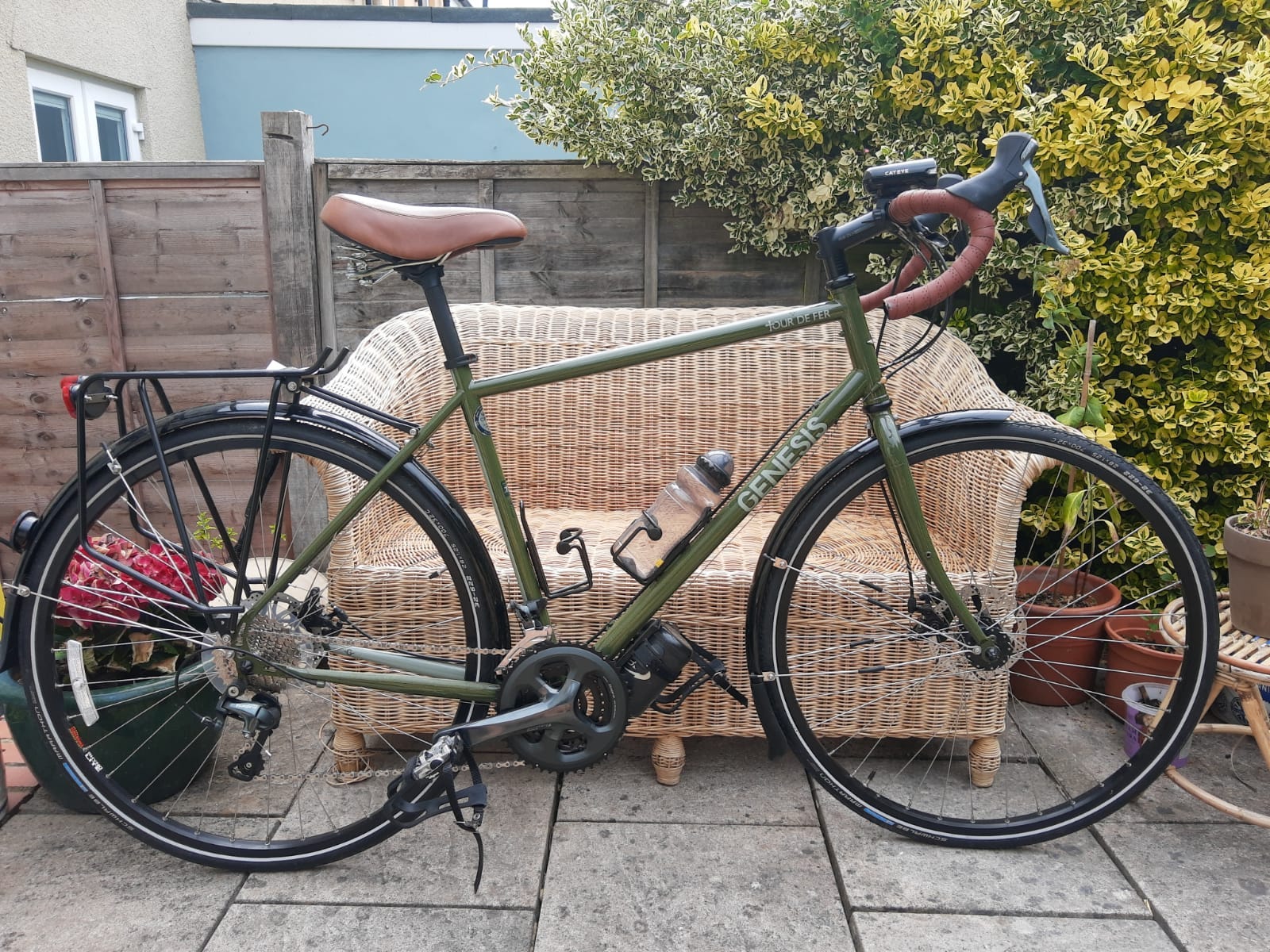
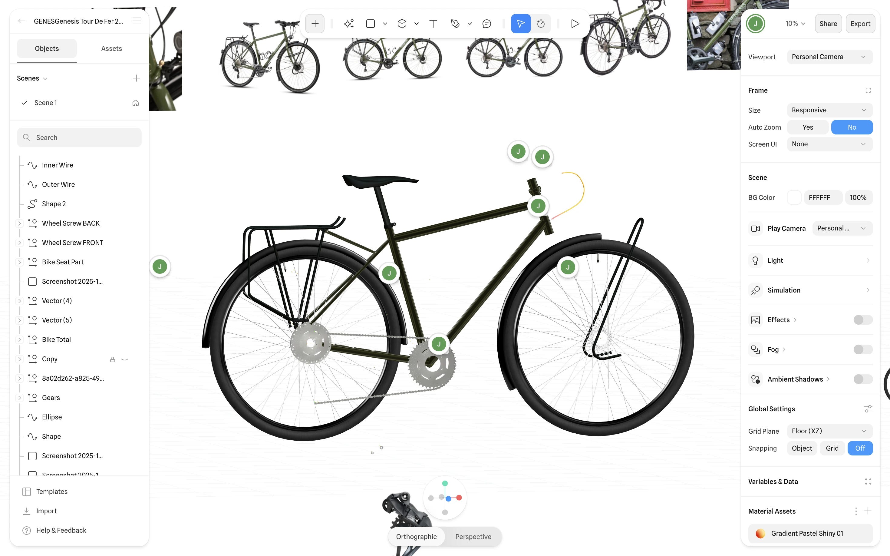
The subject of the build? Genesis — specifically inspired by the Tour de Fer 20, a bike I own, ride, and absolutely love.
Instead of quietly working on the project in the background, I’m documenting everything — from the early scribbles all the way to production-ready 3D interactions.
And like every project I take seriously, it all starts with one thing:
Research.
Why Research Comes First
Before opening Blender, firing up WebGL, or designing a pixel in Figma, I start by grounding myself in why the site should look and feel a certain way.
Research helps me define:
The emotional tone (adventure, ruggedness, reliability)
A visual language that matches the brand
Where 3D can enhance — not overwhelm — the product
What competitors are doing (and failing to do)
What the final experience should NOT become
Good research isn’t about stealing inspiration — it’s about removing guesswork.
Understanding Genesis
Genesis isn’t a hyper-performance race brand yelling carbon-aero-everything.
They sit in that adventure-first space — touring, gravel, exploration, the “go further even when you’re not sure where you’re heading” vibe.
Their current website works… but:
It’s product-first rather than experience-first
It isn’t visually cinematic
It leaves storytelling potential on the table
That gap is where the 3D concept lives — creating a digital experience that reflects the feeling of owning the bike, not just listing features.
The mantra I keep coming back to:
Elevate the brand’s identity, don’t rewrite it.
Competitor + Category Study
Next, I study what’s happening across cycling and adjacent categories.
I look at:
Direct bike competitors
Adventure + outdoor brands
Premium UI experiences
WebGL-heavy sites
Any company already pushing interaction design
Patterns I notice:
Some brands lean ultra-premium
Some go sporty, racing-focused
Some are rich in visuals but shallow in storytelling
Others communicate well but don’t feel exciting
Mapping this spectrum helps me position my build:
Adventure-forward, clean, tangible, informative — with 3D serving clarity, not distraction.
Studio-Level Inspiration Sources
From here, I pull influences from design spaces outside cycling — studios known for strong identity work.
Some references from my clipboard:
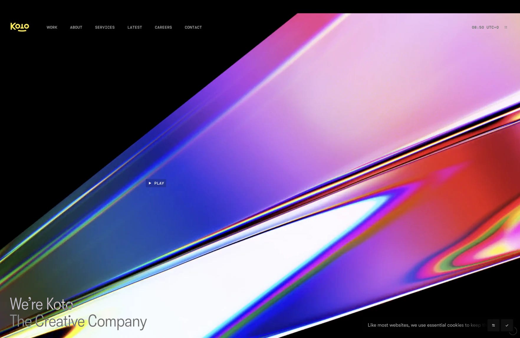
Koto — beautifully simple, strategic identity work
Ragged Edge — bold brand storytelling and confident layouts
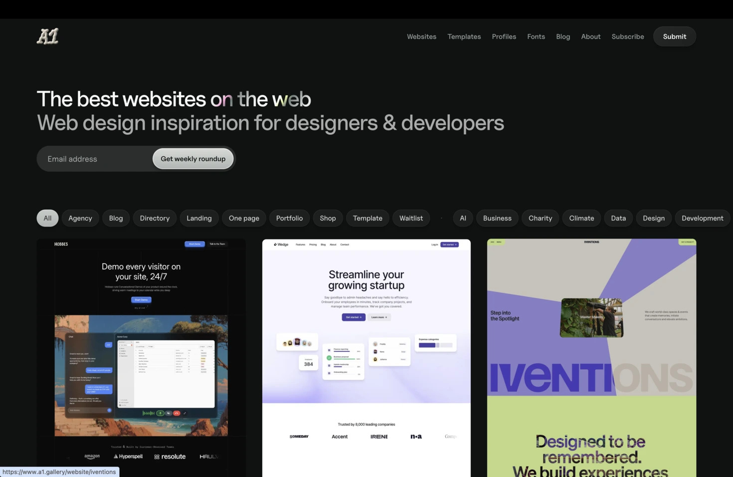
A01 / A1 (depending on how you heard it) — minimal, elegant execution
Mobin / Jack styling references — tactile, interesting motion + type
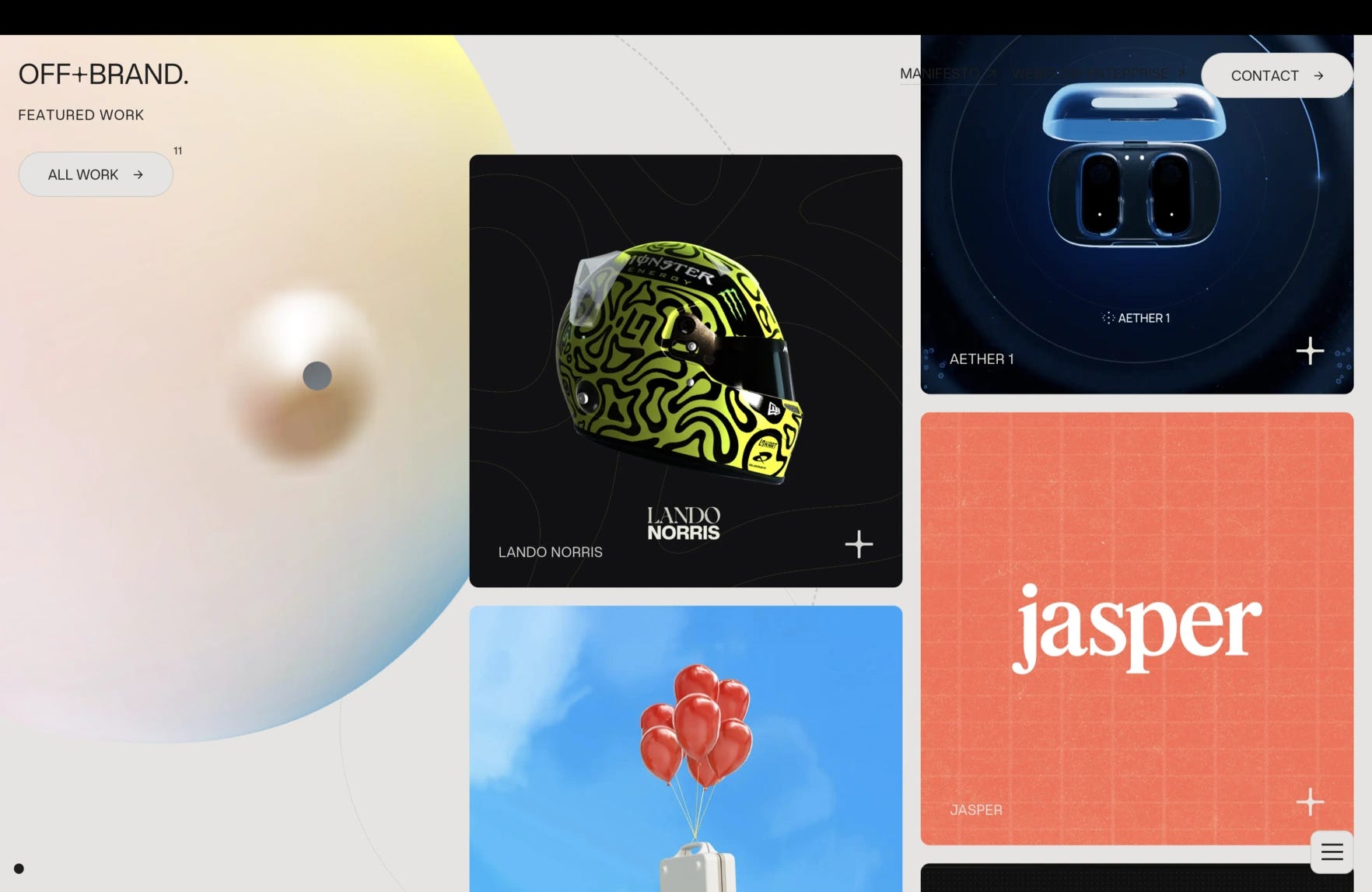
Offbrand agency - killer Glasgow based agency
I’m not copying them — I’m extracting lessons:
How bold is too bold?
Where can typography carry tone?
How do brands use whitespace vs. photography?
What UI gestures feel adventurous vs. clinical?
Again — ingredients, not templates.
Building the Visual Universe
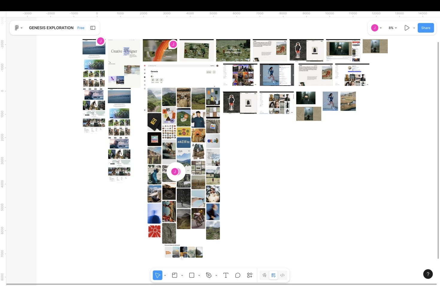
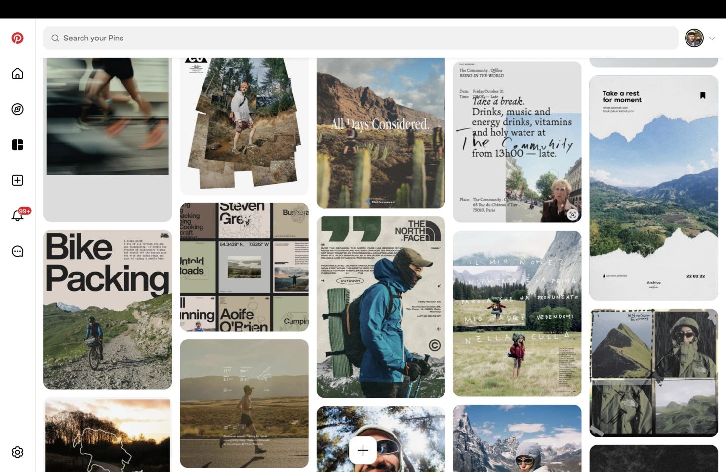
Once I’ve soaked in brand, competitors, and studio influences, it’s moodboard time.
Tools: Figma, every time.
My reference boards include:
Color palettes — earthy/outdoorsy tones vs. high-contrast UI
Typography — rugged serif, clean sans, mixed approach?
Photography direction — gritty gravel vs. studio polish
UI interactions — scrolling depth, pinned elements, motion
3D renders that evoke adventure, not just pretty shading
Navigation patterns — including that off-canvas menu treatment
Seeing all these pieces together helps me define:
What visuals stay true to Genesis
What pushes the site forward
Where to pull back instead of flex
By the end of moodboarding, I’ve got a north star:
A grounded, human, curiosity-driven experience that visually matches the act of touring itself.
Where Research Leaves Us
After gathering all this:
I know the emotional tone
I know the visual identity boundaries
I know the UX style that fits the brand
I understand the competitive landscape
And I have a toolbox of design references from cycling AND world-class brand studios
This gives me the confidence to move into design without guessing.
What’s Next
Part 2 is where I start the 3D.
Next episode:
Defining structure, flow, and the essential story the site needs to tell — before a single pixel gets fancy.
See you in Part 2.
Ciao.
See you next week for 3D design video!
Jack